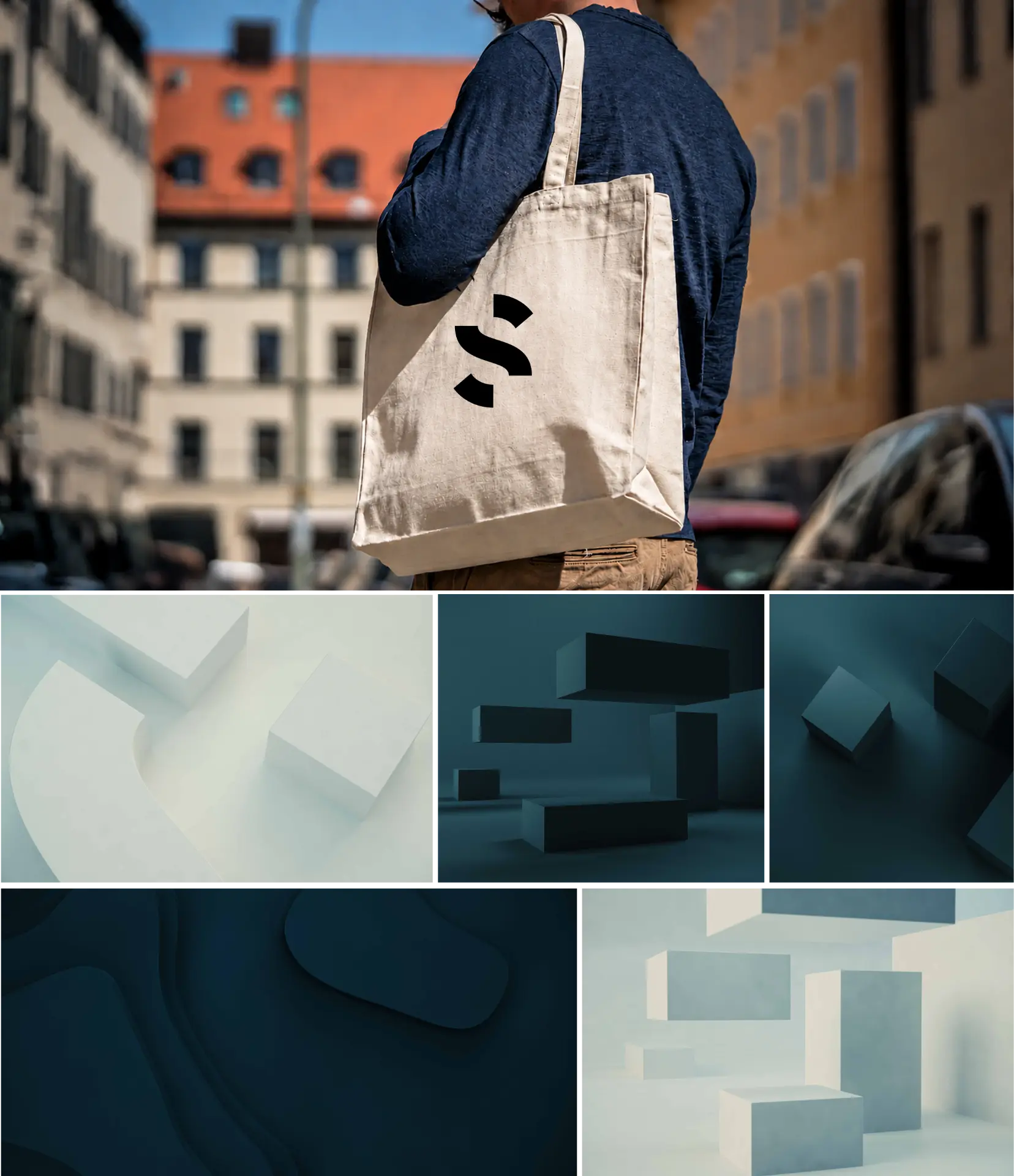
Spacemaker identity
A visual identity for an AI-powered design platform helping architects and urban planners evaluate and optimize building proposals. Built around a distinctive S symbol, the system scales across product, brand and marketing while reflecting the relationship between form and space.
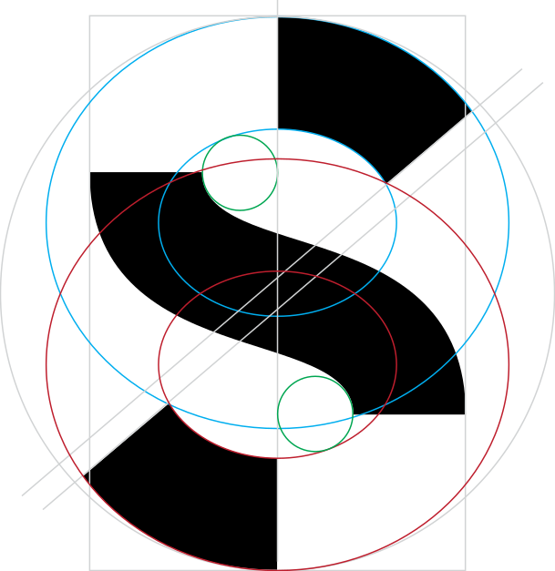
Our logo contains a symbol that is based on a simple letter S. The symbol is carefully constructed to create friction between the 3 shapes while maintaining balance. It is designed with a boldness that craves attention and sticks out even at the smallest sizes.
Confident, unexpected, transforming, our symbol illustrates the exploration of shapes and the spaces in between.
The S symbol is meant to be used by itself, unlocked from the wordmark. This allows flexibility to present the S with greater prominence while maintaining an open and modern presentation.


Midnight
- HEX
- #171A1F
- RGB
- 23, 26, 31
- CMYK
- 26, 16, 0, 88
Fjord
- HEX
- #87AFEF
- RGB
- 135, 175, 239
- CMYK
- 44, 27, 0, 6
Glacier
- HEX
- #B3D7F4
- RGB
- 179, 215, 244
- CMYK
- 27, 12, 0, 4
Slate
- HEX
- #474F59
- RGB
- 71, 79, 89
- CMYK
- 20, 11, 0, 65
Pewter
- HEX
- #5E6670
- RGB
- 94, 102, 112
- CMYK
- 16, 9, 0, 56
Limestone
- HEX
- #C8C8C0
- RGB
- 200, 200, 192
- CMYK
- 0, 0, 4, 22
Coral
- HEX
- #DA7F78
- RGB
- 218, 127, 120
- CMYK
- 0, 42, 45, 15
When we communicate across all platforms we always aim to be short, simple and visual. Clear icons and illustrations help users understand complex data and make decisions quickly. The visual language is calm, light and confident, with colour used sparingly to guide attention and support accessibility.